
Kindest: Empowering Non-Profits to Accomplish More Good
A redesigned website highlighting Kindest’s full consulting services and integrating their suite of tools and resources to help non-profits access support and guidance more efficiently.
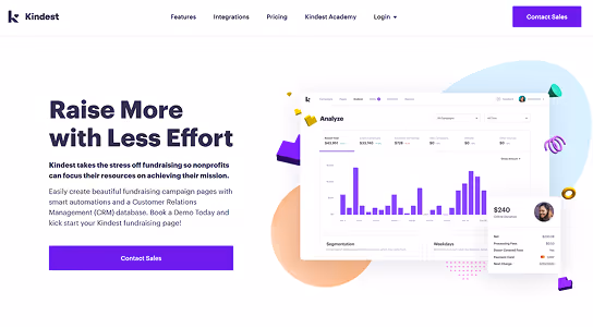
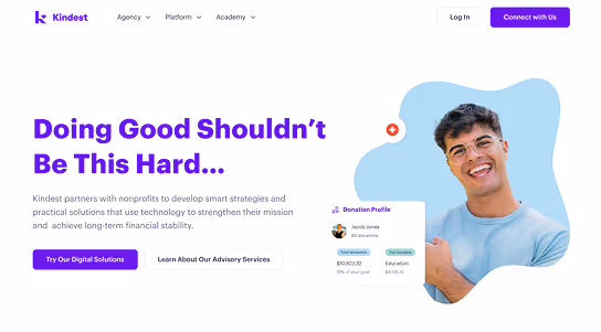
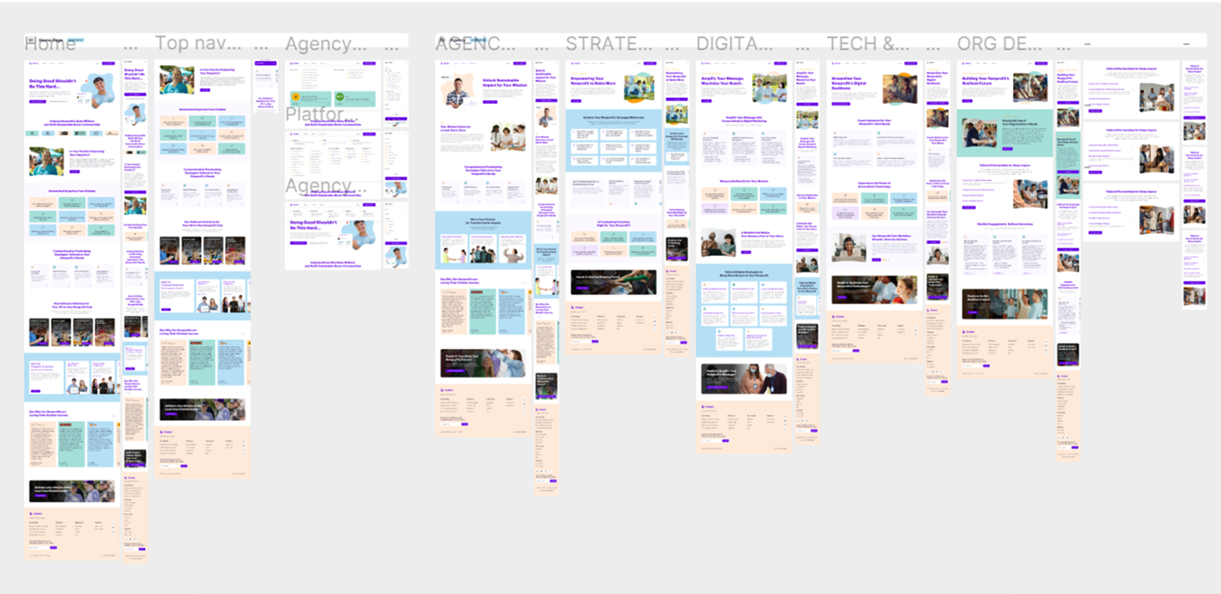
The original website (left) was ready to become more human-centric.
ROLE
TOOLS
DETAILS
While redesigning Kindest’s website, I identified an opportunity to better showcase their expanding consulting services for non-profits and integrate their Academy of tools more seamlessly into the user experience.
Problem Statement
Kindest’s existing website focused primarily on fundraising support, creating friction for users trying to discover their broader consulting offerings. Key user personas faced the following challenges:
- Non-profit leaders struggled to understand the full range of consulting services beyond fundraising.
- Program managers and staff found it difficult to locate and access the Academy of Tools resources efficiently.
- Potential partners or donors could not easily evaluate Kindest’s expertise or the practical impact of their programs.
Impact
- Users overlooked key consulting offerings, limiting engagement and service adoption.
- Resources in the Academy of tools were underutilized.
- Potential clients and partners experienced uncertainty about how Kindest could meet their needs.
Opportunity
Redesigning the website allowed us to create a user-centered experience that highlighted Kindest’s full consulting capabilities while improving discoverability and accessibility of the Academy full of useful tools for non-profits. By balancing clarity for first-time visitors with depth for returning users, we could strengthen engagement, support non-profit partners more effectively, and position Kindest as a comprehensive resource for non-profit growth.
User Research to Inform Kindest’s New Website
I led research initiatives to understand how non-profits, program managers, and potential partners interacted with Kindest’s website and accessed their services, using insights to guide the redesign.
Stakeholder Interviews
Non-Profit Leader Interviews
Program Staff Observations
Content Usage Analysis
Prototype Feedback Sessions
Workflow Mapping Workshops
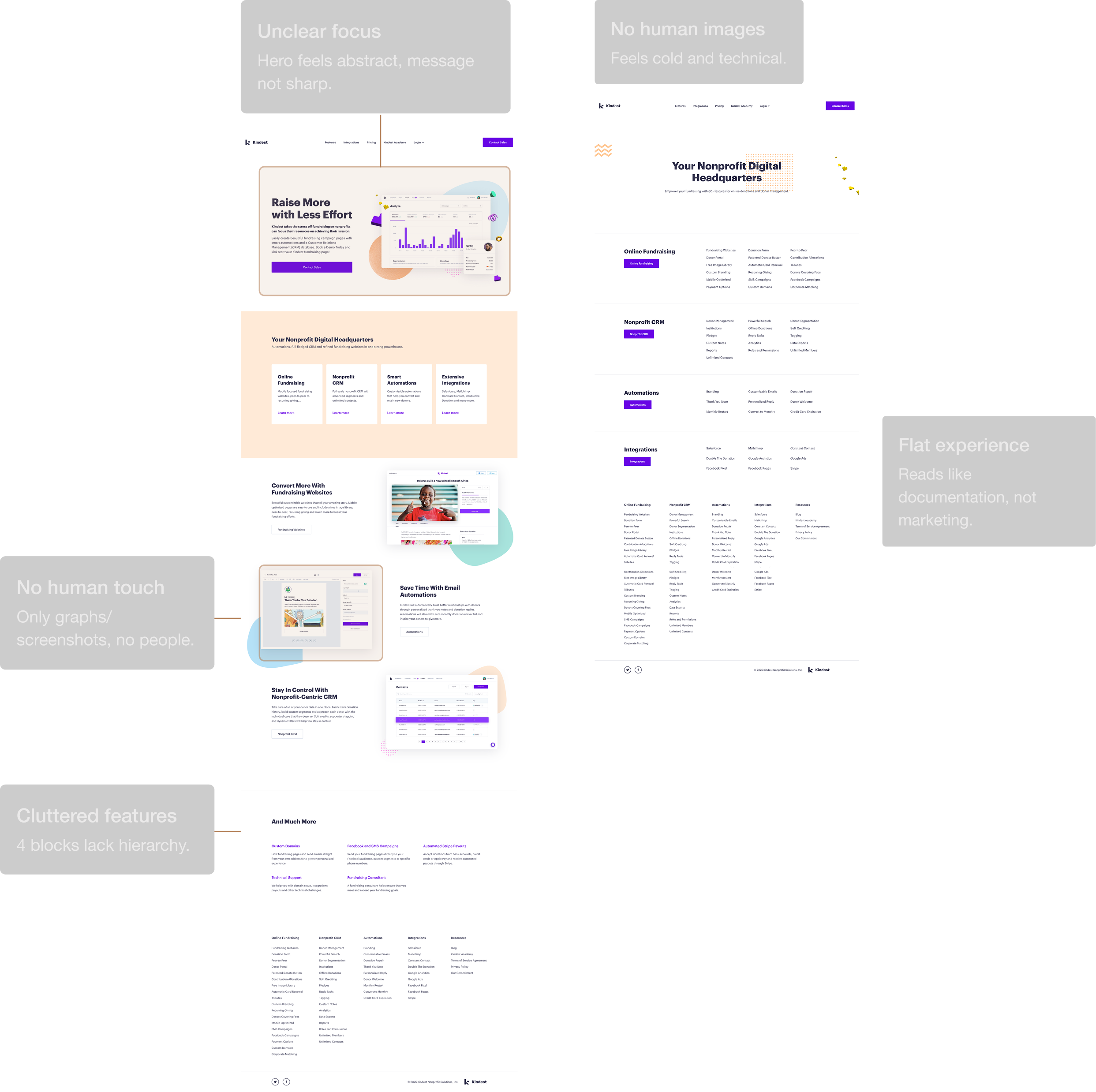
Audit of Kindest’s Existing Website
I conducted a thorough evaluation of Kindest’s existing website, mapping content, layout, and functionality against insights from our user research. This audit highlighted critical areas where the experience failed to effectively communicate consulting services, showcase resources, and engage users.
Key Findings
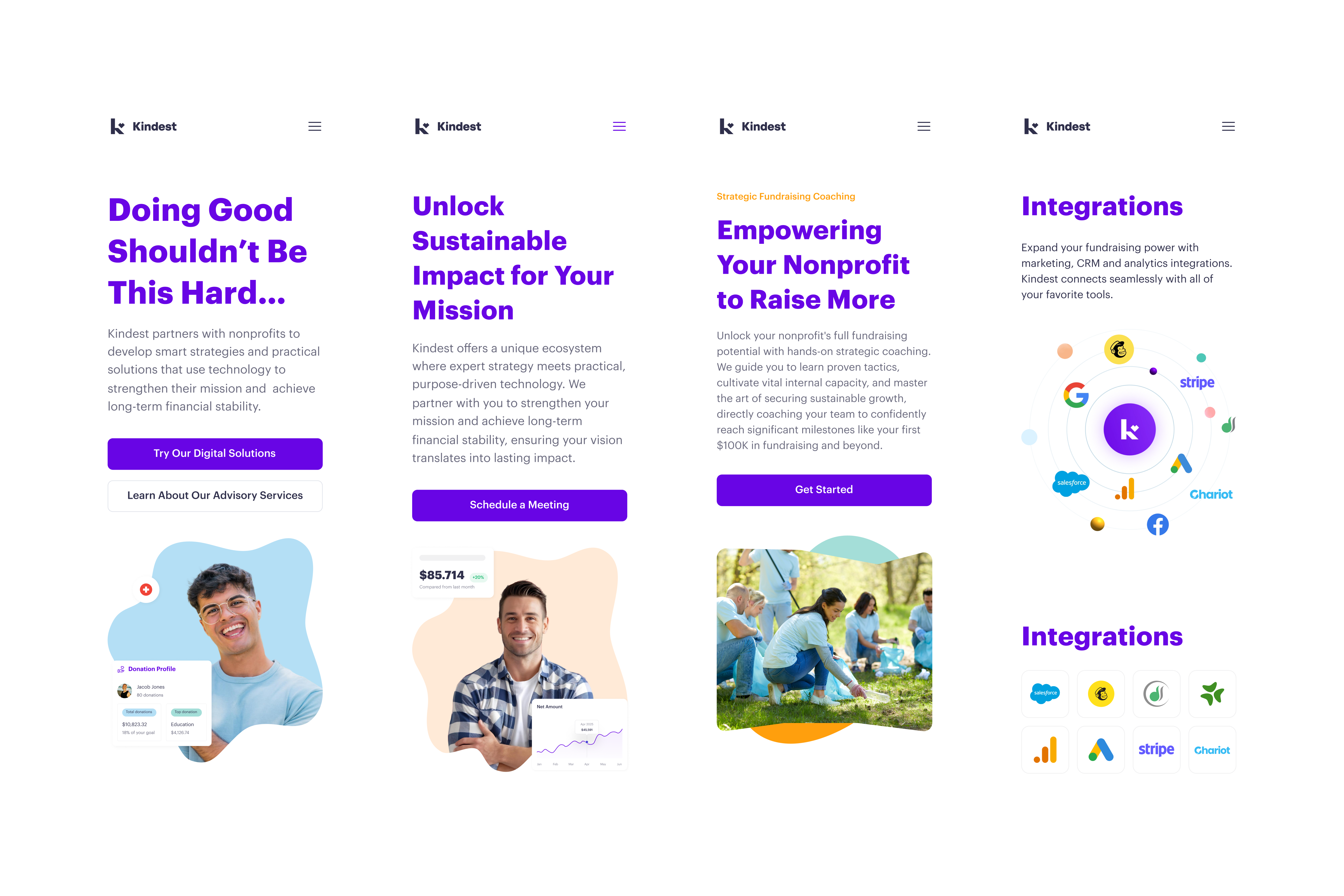
Lack of human elements – Imagery and visuals did not reflect real people or the communities Kindest supports, weakening emotional connection.
Unclear language – Service descriptions and resource labels were confusing, making it hard for users to understand offerings or next steps.
Fragmented visual language – The style used in the Academy section was not carried throughout the site, resulting in inconsistent design and reduced cohesion.
Content overload – Long blocks of text without hierarchy or clear calls-to-action caused fatigue and reduced engagement.
Poor navigation – Users struggled to find relevant services and resources quickly due to unclear hierarchy and labeling.
Outdated or uninspiring imagery – Existing visuals were stale and failed to communicate the vibrancy and impact of Kindest’s work.
This audit provided a clear roadmap for redesign, informing improvements to navigation, content clarity, visual consistency, and user engagement across the site.
Observations I Gathered
Human Connection
New Service Visibility
Seamless Resource Access
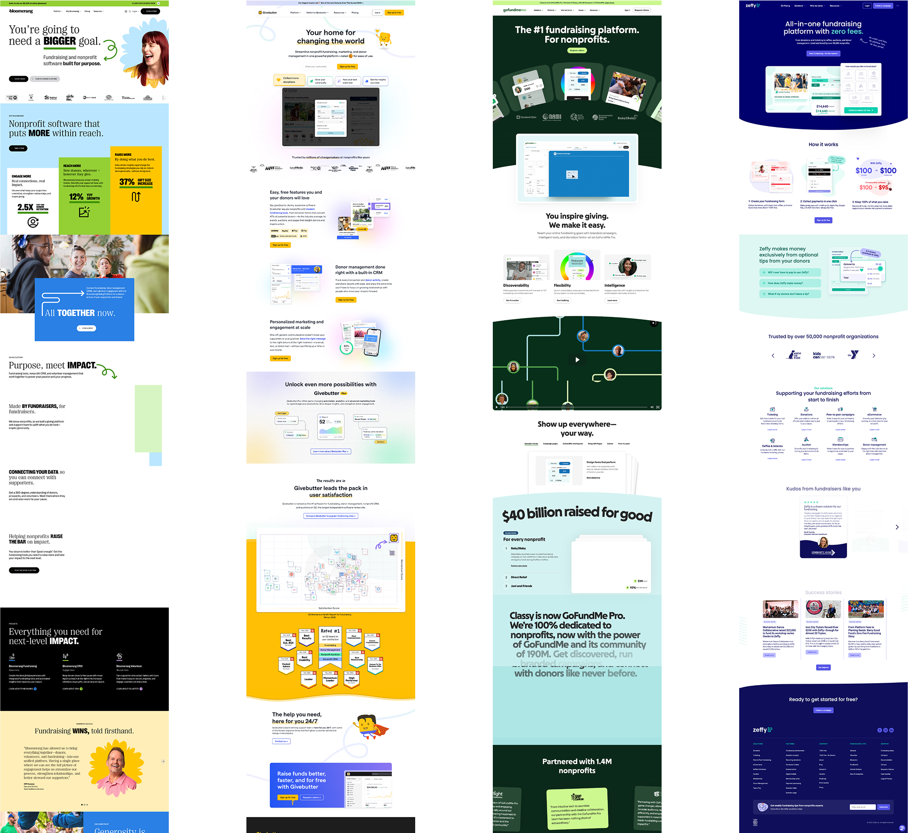
I evaluated non-profit consulting websites’ navigation, resource organization, and user workflows to understand best practices and identify gaps where Kindest could stand out.
Competitor Analysis
I wanted to ensure that Kindest’s website clearly communicated its full consulting services and resource offerings while addressing gaps left by other non-profit support platforms.I analyzed websites from leading non-profit consulting and support organizations, focusing on how they guide users through discovering services, accessing tools, and taking actionable next steps. I evaluated navigation, resource organization, and engagement strategies to understand market standards and identify opportunities for Kindest to stand out with a human-centered, design-driven approach.
Human-Centered Storytelling
Accessible Resources
Fundraising & Integrations
Actionable Guidance
I collaborated with Kindest’s team to create user-centered content that clearly communicates their expanded consulting services while making tools and resources easily accessible for non-profit leaders and staff.
Business Strategy Alignment
Support action-oriented users – Make it simple for non-profits to access guidance, resources, and next steps.
Build trust and credibility – Use clear, transparent language and showcase Kindest’s expertise through case studies, testimonials, and success stories.
Human-centered presentation – Use imagery and design elements that reflect real people and communities to strengthen emotional connection.
Business Strategy Alignment
Feature/Benefit – Highlight key consulting offerings and explain the tangible benefits for non-profit organizations.
Resource Guidance – Organize tools and educational materials so users can quickly find what is most relevant to their goals.
Business Strategy Alignment
Hierarchical organization – Use clear sections and sub-sections for intuitive navigation.
Detailed outlines – Define information architecture and content placement to ensure consistency and ease of use.
Wireframes & Prototypes
I began by developing low-fidelity wireframes to establish the foundational structure of the website, prioritizing the visibility of Kindest’s consulting services and improving access to resources for non-profits. Once the core layout was defined, I translated the wireframes into interactive Figma prototypes, allowing me to simulate user flows, test navigation, and visualize the placement of human-centered imagery and key content. Throughout this process, I engaged in extensive collaboration with the client, iterating repeatedly based on her feedback to ensure the website captured her vision while remaining intuitive and functional. Each iteration refined interactions, clarified information hierarchy, and balanced aesthetics with usability, ultimately creating a polished prototype that served as a blueprint for the final development.


Design and Development
After finalizing the Figma prototypes, I completed the full high-fidelity design of the website, specifying every interface element, interaction, and visual detail. I documented design notes and content placement to ensure consistency and clarity during development. I then built the site in Webflow, implementing layouts, interactions, and responsive design while iterating closely with the client to refine details in real time. The result was a fully functional, polished website that aligned with Kindest’s strategic goals, enhanced usability, and engaged users effectively. Following thorough testing and feedback cycles, I successfully launched the site, providing non-profits with clear access to consulting services and resources in an intuitive, visually engaging experience.


The Kindest website redesign project allowed me to create a platform that clearly communicates the organization’s expanded consulting services while making tools and resources more accessible to non-profits. By grounding design decisions in user research, I focused on intuitive navigation, human-centered imagery, and actionable content that empowers users to take meaningful next steps.
Key Outcomes
Through a user-centered approach, I designed a website that increases visibility of Kindest’s consulting offerings and streamlines access to resources, making it easier for non-profits to engage with the organization. Iterative prototyping and client collaboration ensured the site reflected Kindest’s vision while maintaining usability and clarity.
Impact on Users
The redesign helps non-profit leaders and staff quickly discover services, navigate resources, and understand how Kindest can support their goals. Clear calls-to-action and simplified workflows encourage meaningful engagement and make the site approachable for a wide range of users.
Impact on the Organization
By integrating all services and resources into a cohesive, user-friendly website, Kindest is now better positioned to demonstrate its expertise, attract new partners, and support more non-profits effectively. New consulting services are front and center, expanding Kindest’s own profitability. The polished Webflow implementation enables easy updates and scalability as the organization grows.
Strategic Value
Beyond immediate usability improvements, this project illustrates how aligning design with user needs and organizational goals can amplify impact. The site now serves as both a functional tool and a showcase of Kindest’s consulting capabilities, supporting mission-driven growth.
